Company
Crane
Project
Redesign and rebrand Crane Stationary's e-commerce website.
Background
Crane is a luxury stationary company.
Responsibilities
UX Research
Visual UI Design
Overview
🎯
Problem
Crane’s shopping experience made it harder for customers to quickly discover products, compare options, and purchase with confidence. The site needed a cleaner path to conversion and a stronger premium brand presence.
🚀
Solution
Led end-to-end redesign focused on product discovery, clearer navigation, stronger product detail pages, and a smoother cart/checkout flow. Elevated the visual system to better match the quality of the brand.
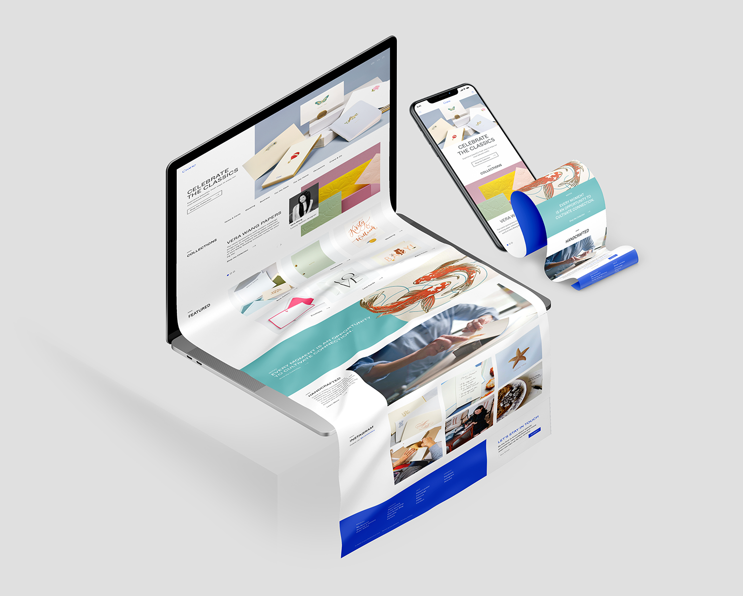
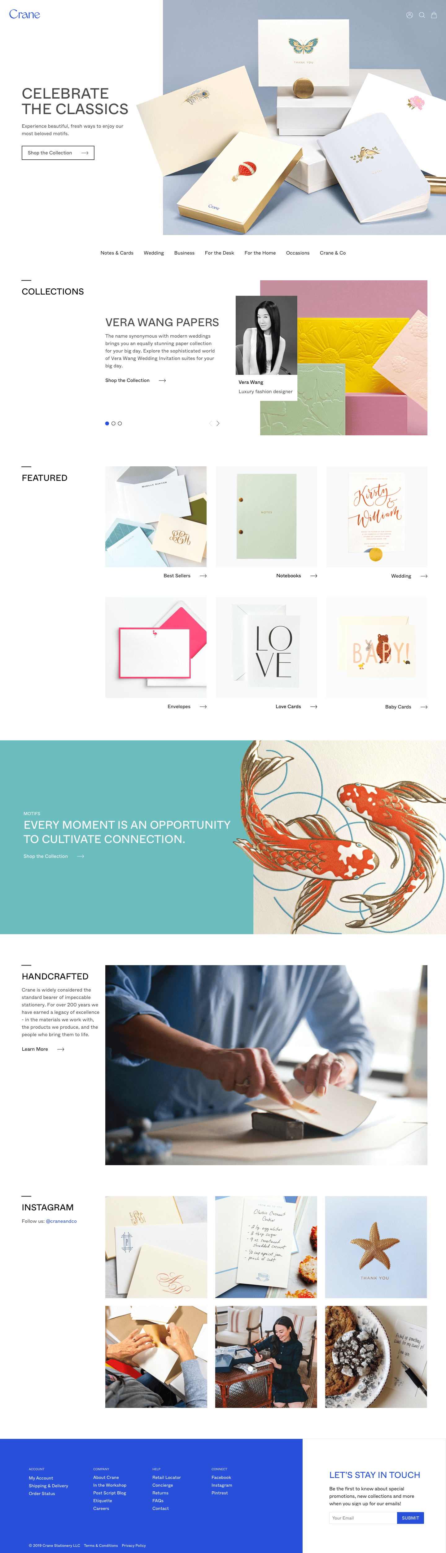
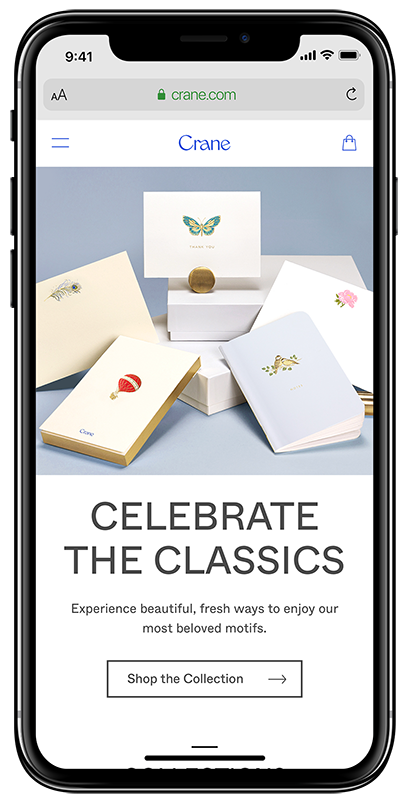
Homepage
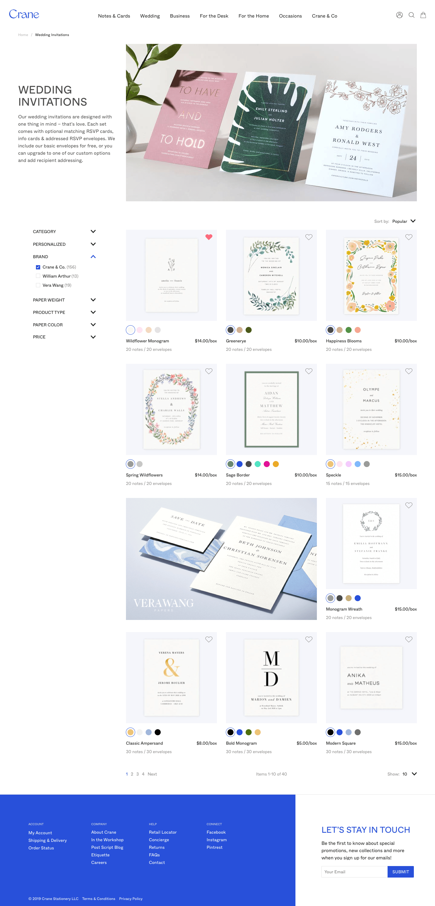
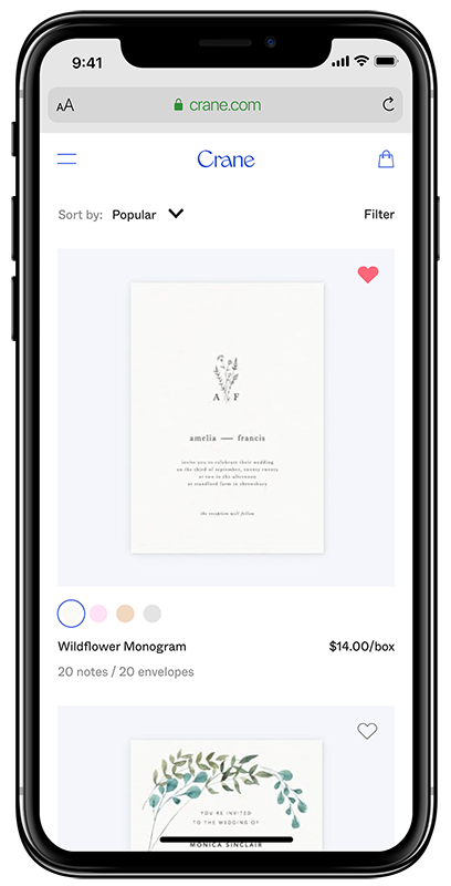
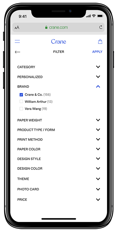
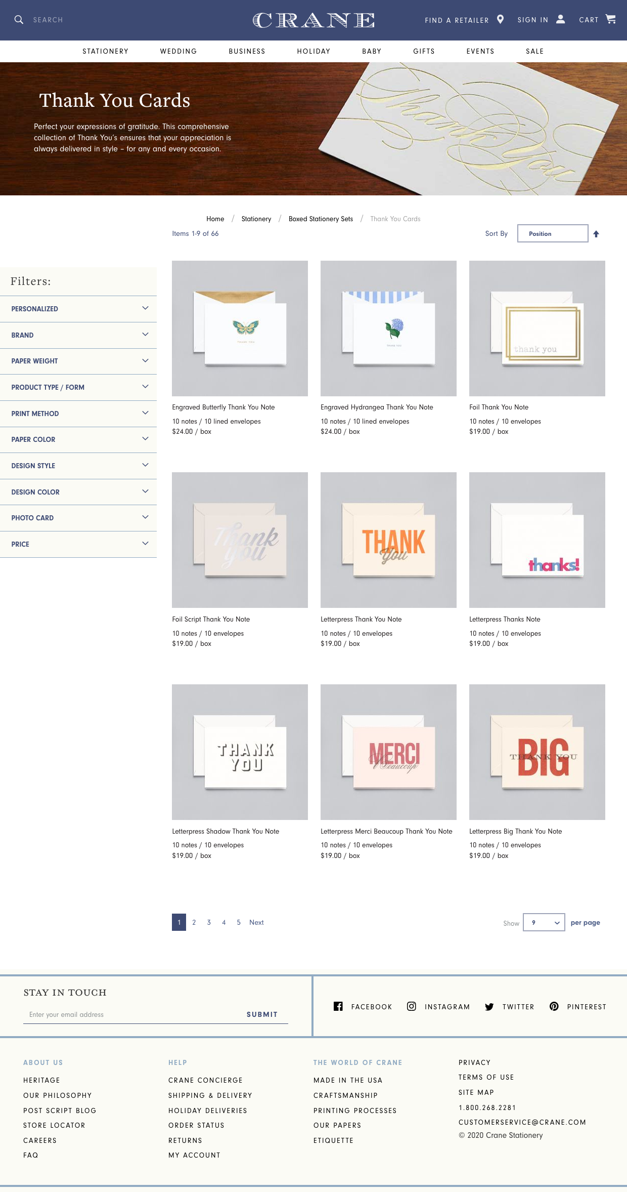
Product Category
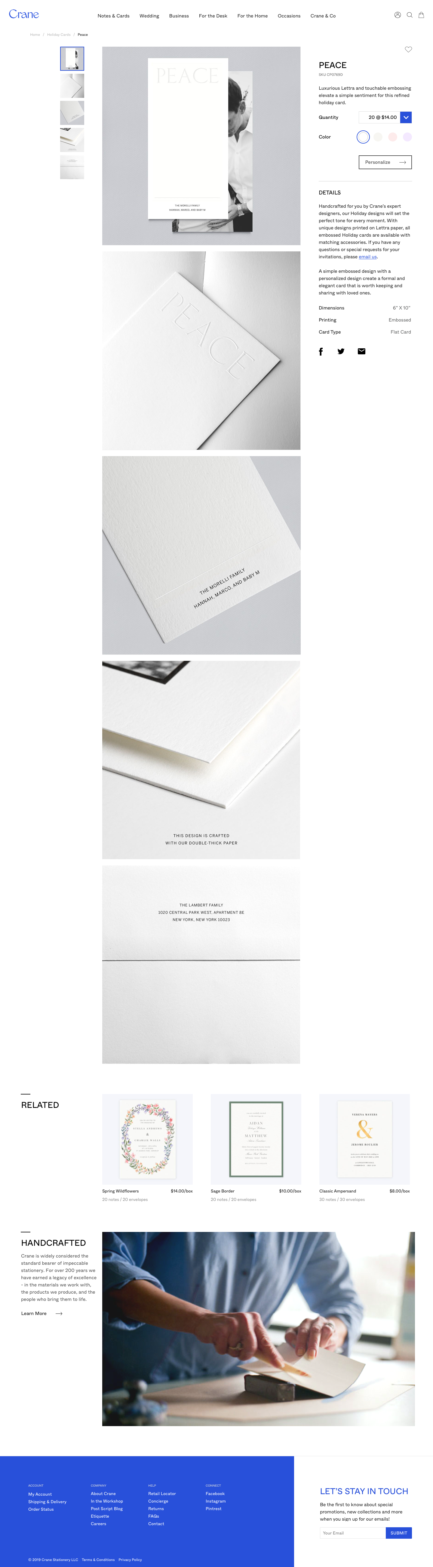
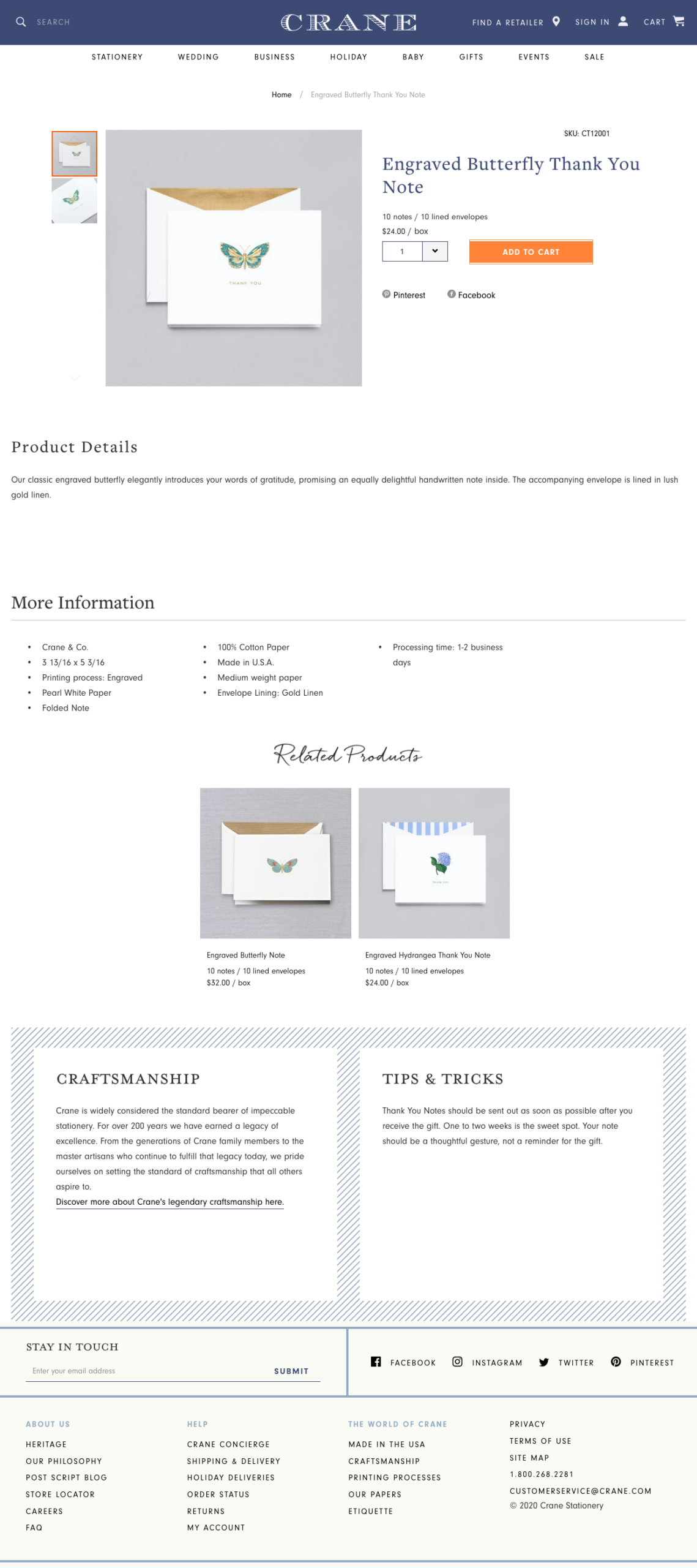
Product Details (PDP)
Mobile
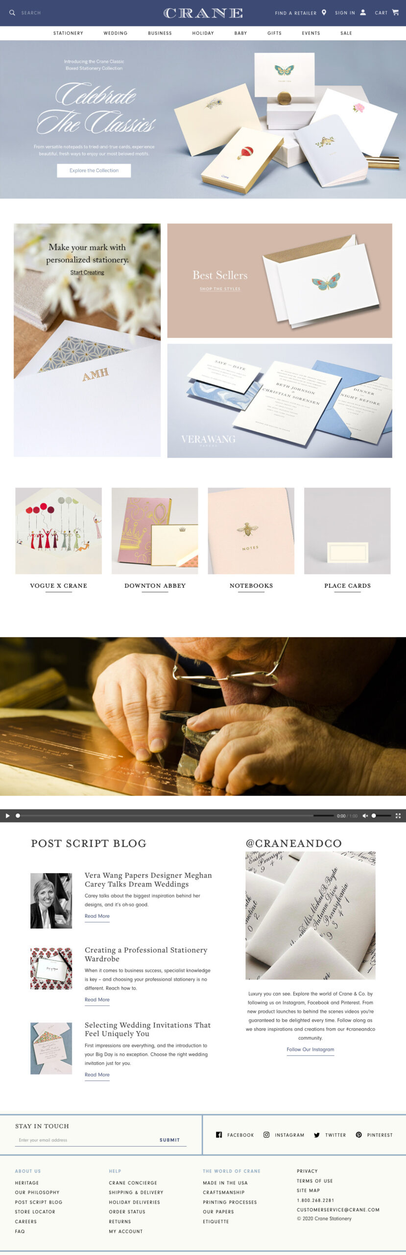
Previous Design
More Projects

© 1982 | Product Designer | jkhan@madebykhan.com