Company
Crane
Project
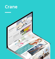
Redesign and rebrand Crane Stationary's e-commerce website.
Background
Crane is a luxury stationary company.
Responsibilities
UX Research
Visual UI Design
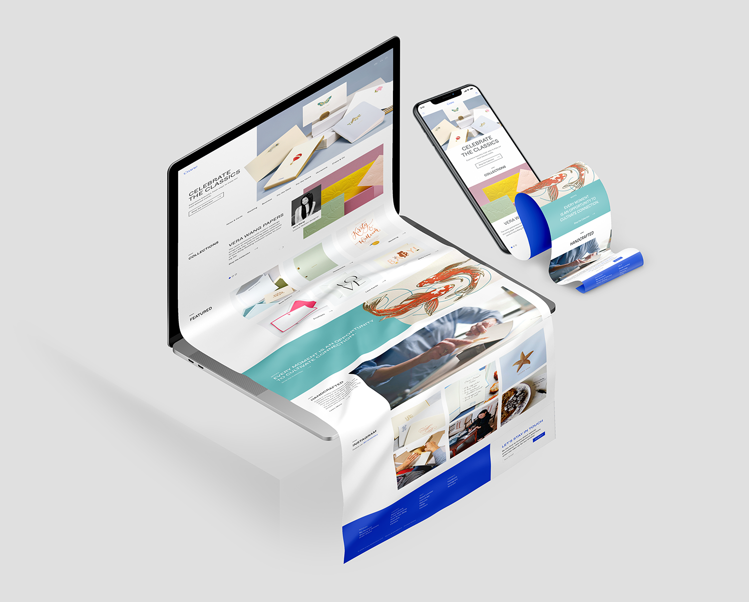
Previous Homepage Design Audit
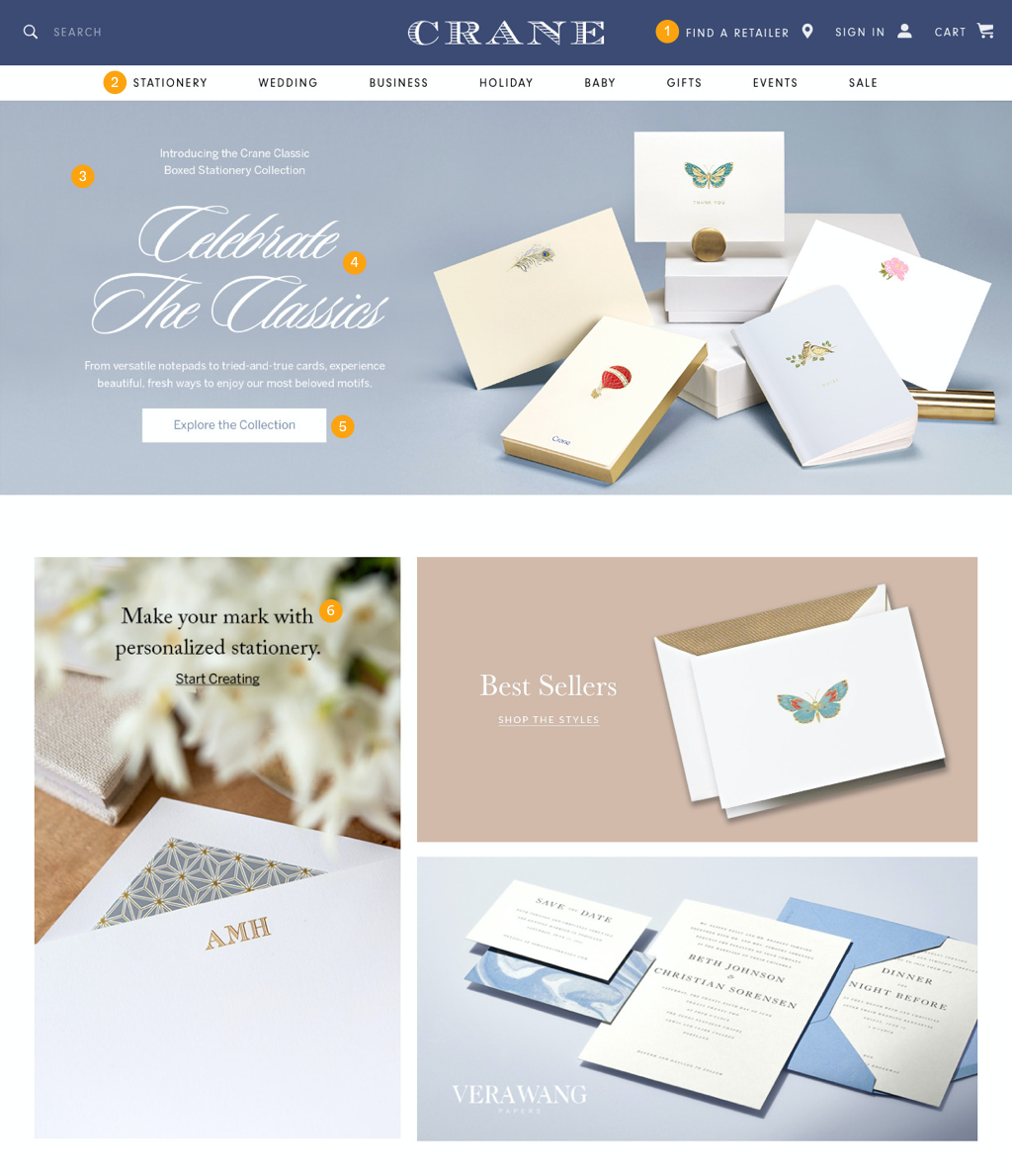
AREAS FOR IMPROVEMENT
1. Find Retailer was highlighted at the top but only provided a directory for pre-made products.
2. The navigation site architecture needed to be more precise and transparent to the target audience.
3. Hero images were not responsive.
4. H1 and body copy was not live text but were part of the image, which resulted in poor SEO, ADA compliance, and search-ability issues.
5. CTA was the Hero image, which resulted in a non-responsive design.
6. Highlighted sections were image files, resulting in poor SEO and responsive design.
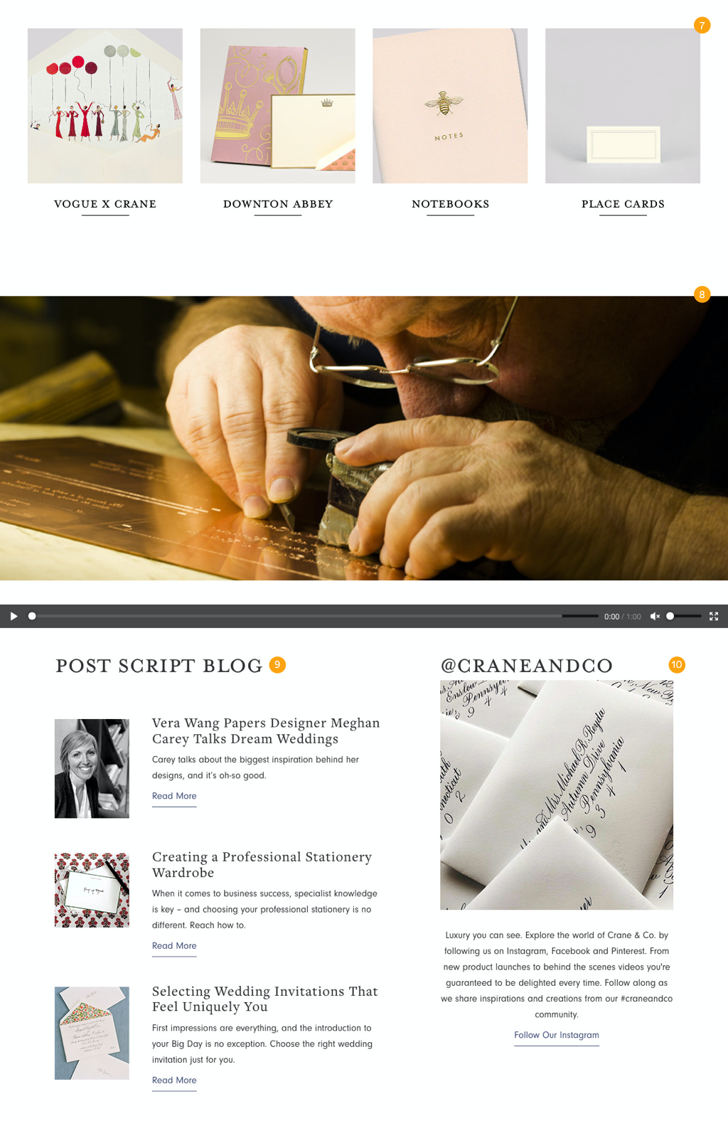
7. Highlight items provide little insight about the products or why they are being highlighted. The homepage was also restricted to 4 products.
8. Video would auto-play without providing customers the information about the current video.
9. Blog was not connected, resulting in a static blog section and would require manual updating each time a post was created. Additionally, outside of visiting the linked article, there was no link to the blog.
10. Instagram was highlighted but needed to be managed or maintained.
Rebrand
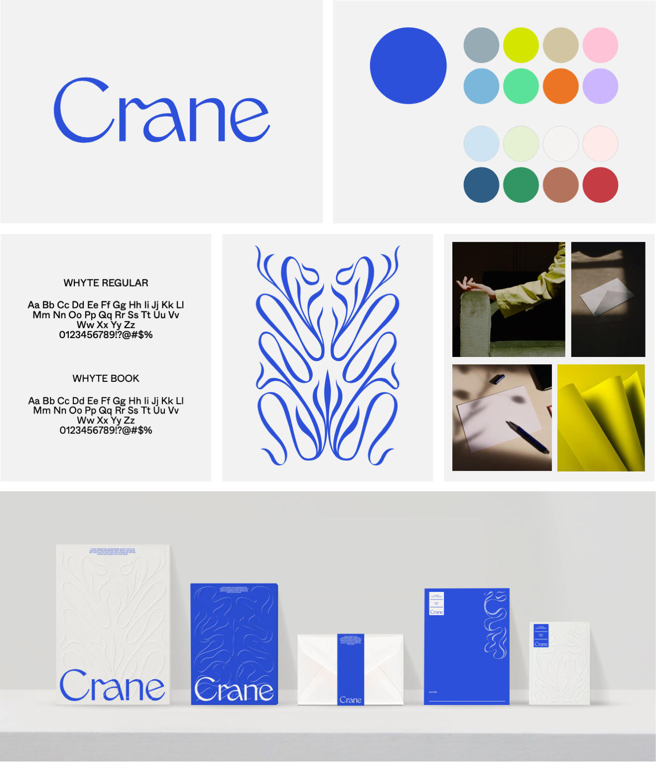
Before redesigning the e-commerce website, I worked closely with an outside agency to rebrand and redesign the Cranes logo, colors, and typography. The concept was to appeal to a younger audience and modernize the brand image.
Research
I surveyed 80 customers to conduct quantitative and qualitative research.
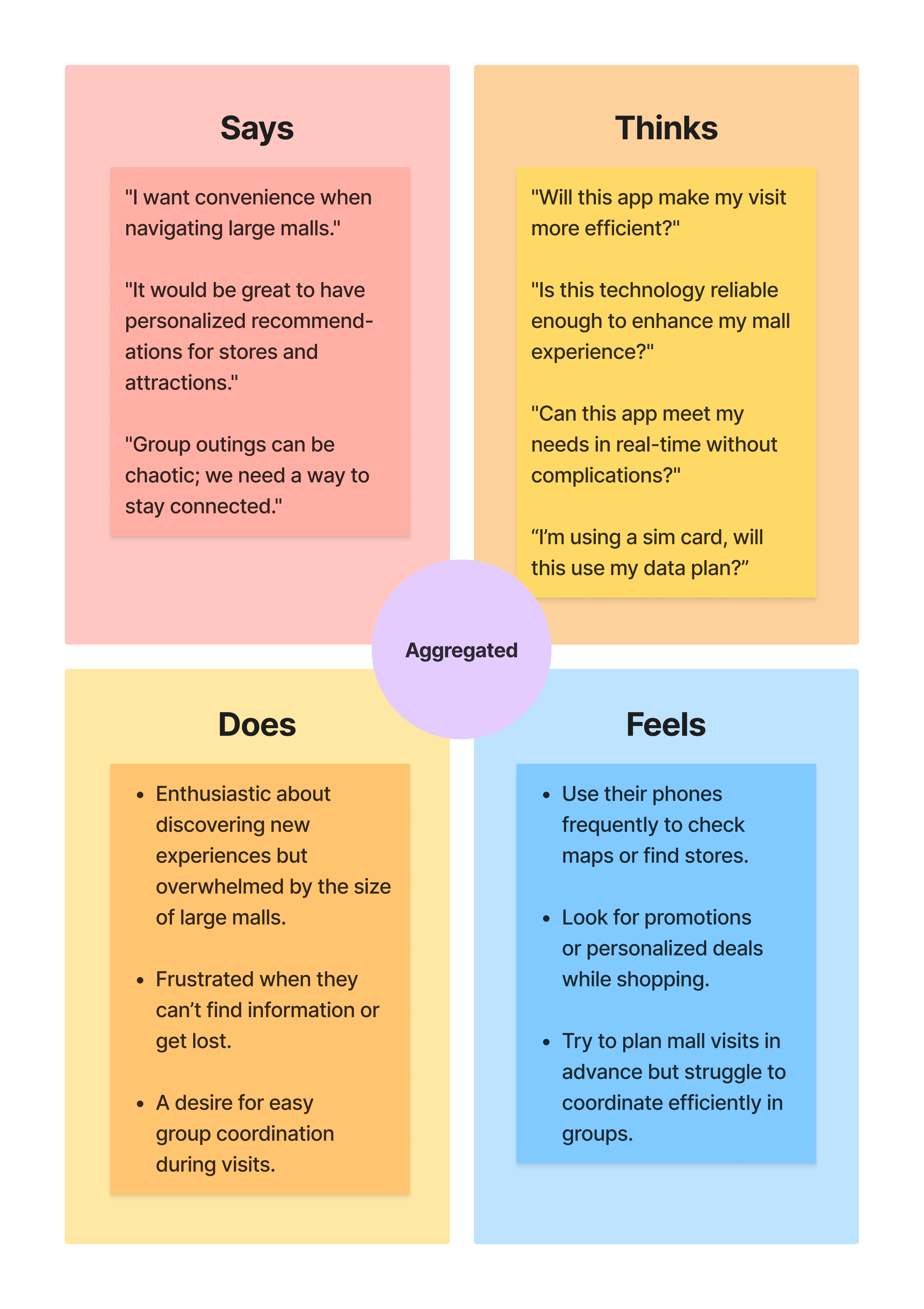
Aggregated Empathy Map
Based on customers' answers, I generated an empathy map.
Persona's
I created the personas based on research, survey questions, and empathy maps.
They provide an overview of our users and the pain points we must address.
Problem Statement
Users seeking elegant greeting cards and stationery often encounter significant challenges when navigating the website. They need help accessing clear and detailed product descriptions highlighting personalization options, variations, and customization features for each card. This lack of intuitive navigation and comprehensive information leads to frustration, as users cannot make informed purchase decisions.
Furthermore, users may need an effective way to filter or categorize products based on personalization features and variations (size, color, and design elements). As a result, they experience a less satisfying shopping journey, risking the potential to choose less-than-ideal cards that do not align with their expectations for elegance and uniqueness.
Hypothesis Solution
To enhance the user experience on the e-commerce stationery website and address the challenges outlined in the problem statement, we propose implementing the following solutions:
Intuitive Navigation, Discovery and Filtering System:
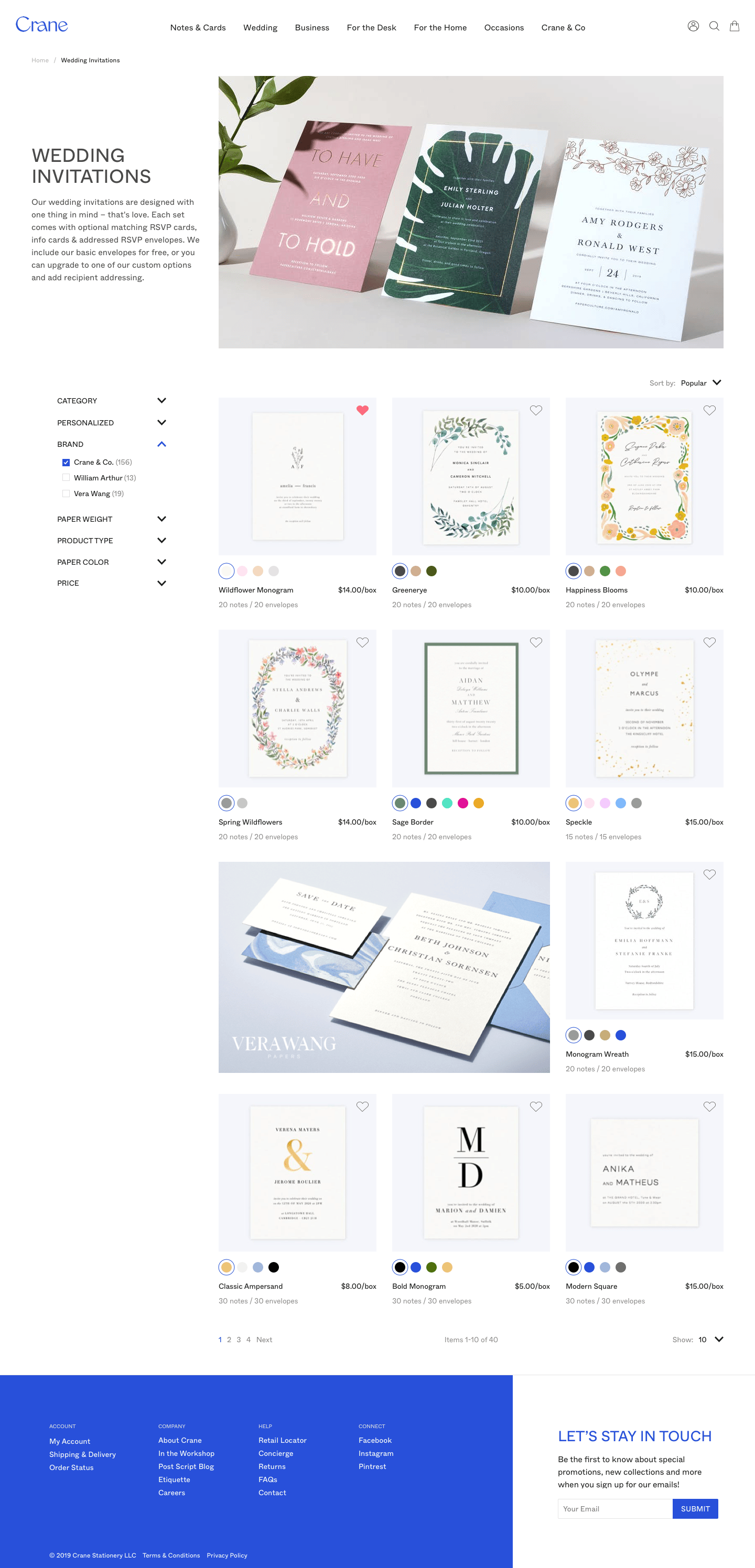
- Hypothesis: By redesigning the website’s navigation to include a more intuitive filtering system, users can quickly locate cards that match their preferences for elegance, personalization, and design variations.
- Implementation: Introduce filters for categories such as "Occasion," "Personalization Options," "Design Variations" (e.g., size, color, paper type), and "Style" (e.g., minimalist, floral, modern). This will allow users to narrow their options based on their specific needs quickly.
Goal Statement
To enhance the user experience on the e-commerce platform by improving the navigation system and product detail pages. This will allow users to find the cards quickly and stationery they are looking for, easily access detailed information about customization options and variations and confidently make informed purchasing decisions.
Design Solution
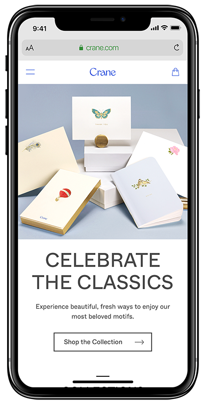
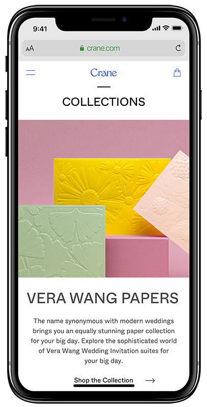
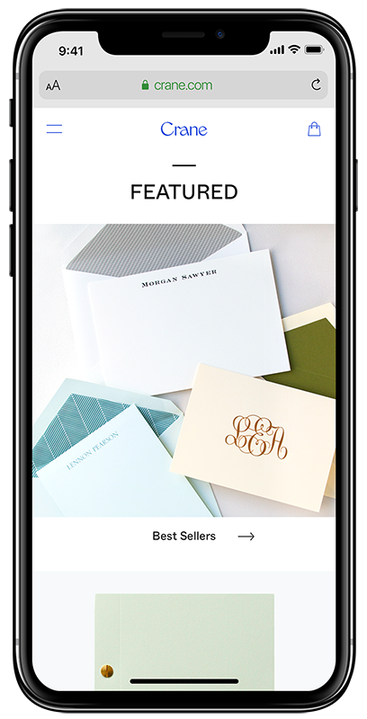
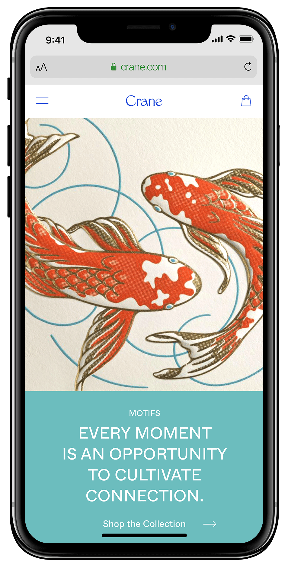
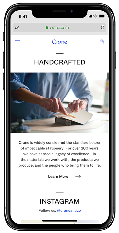
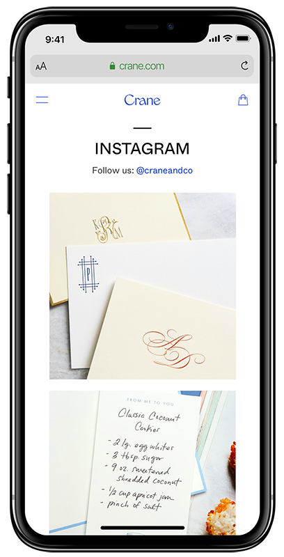
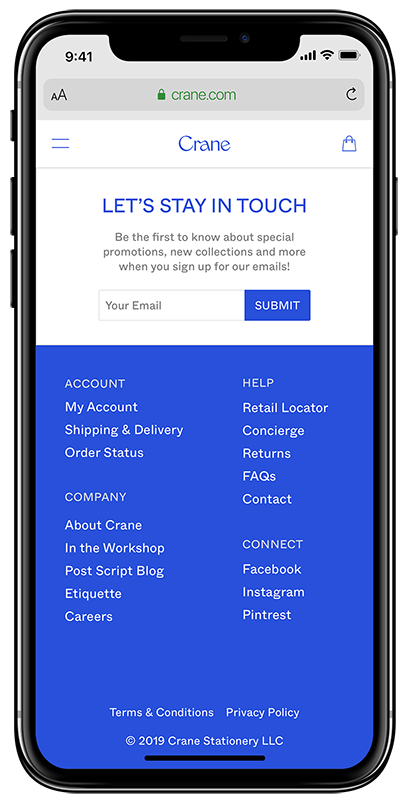
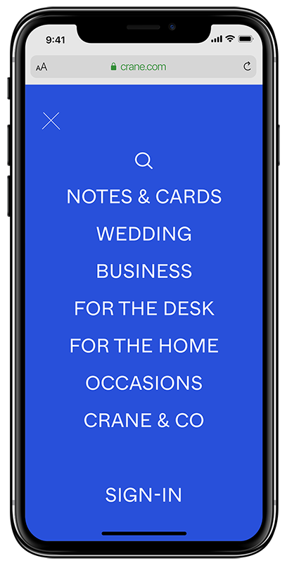
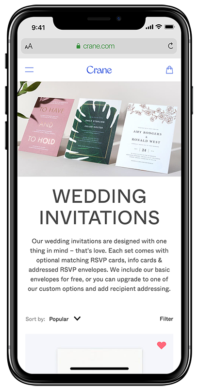
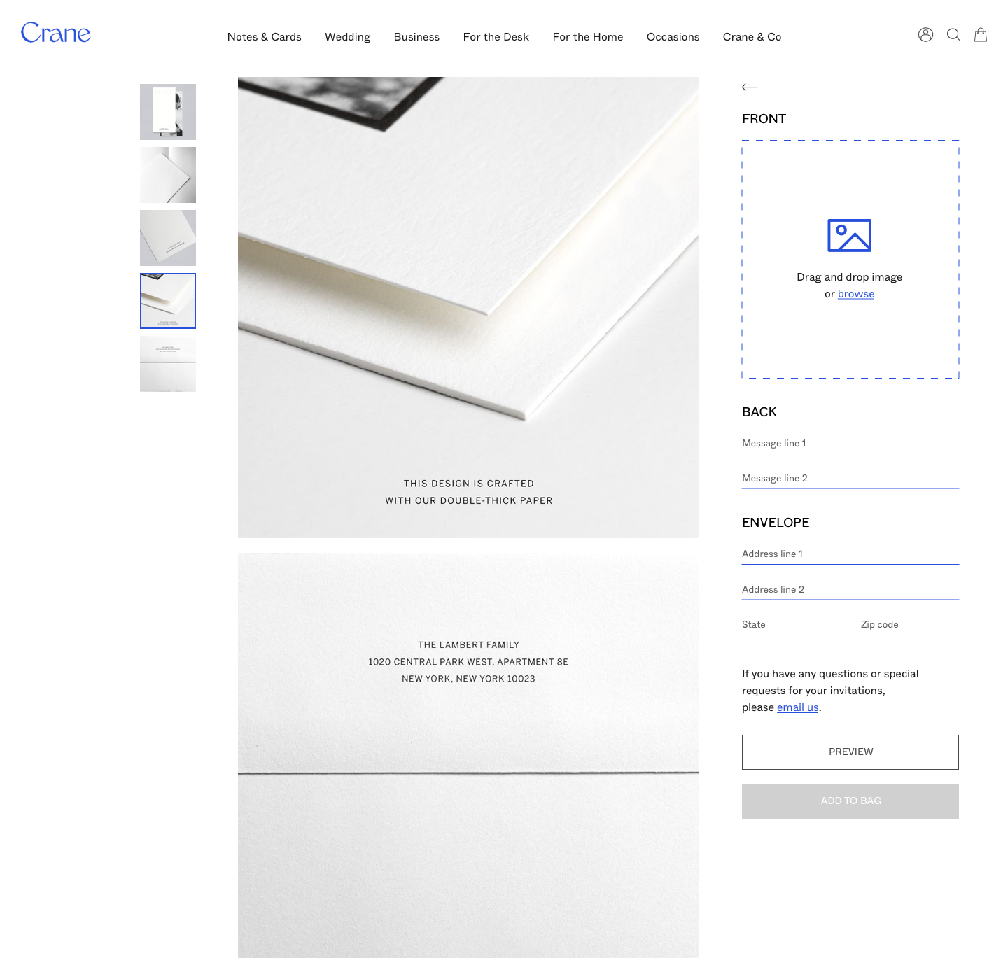
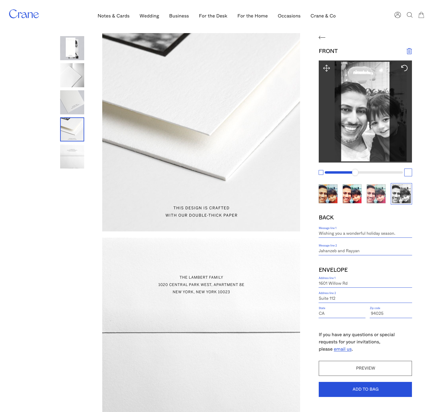
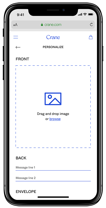
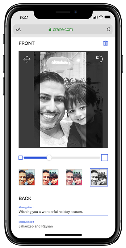
Using the research, multiple wireframe designs, and lo-fi user testing, the final design solution is below.
Homepage Redesign

Product Category
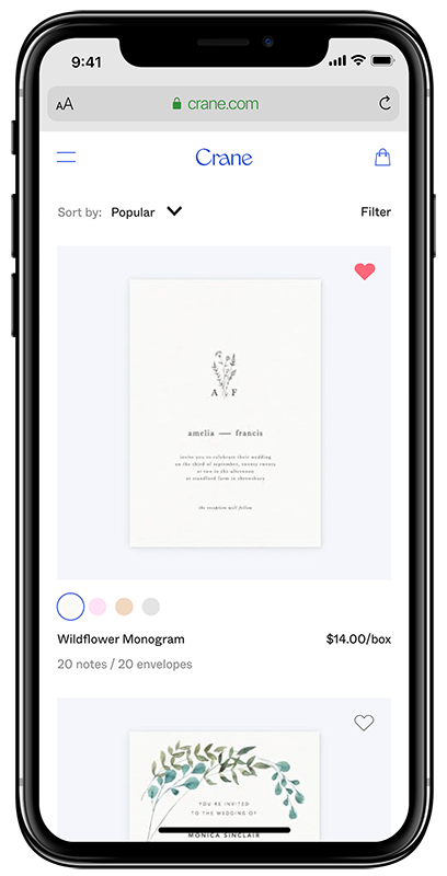
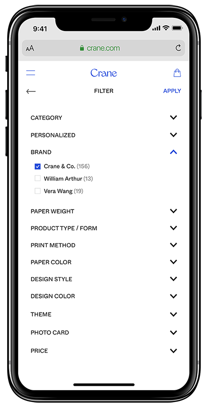
Product Details

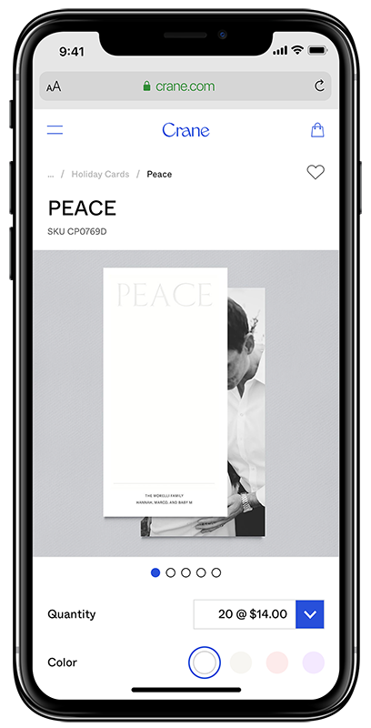
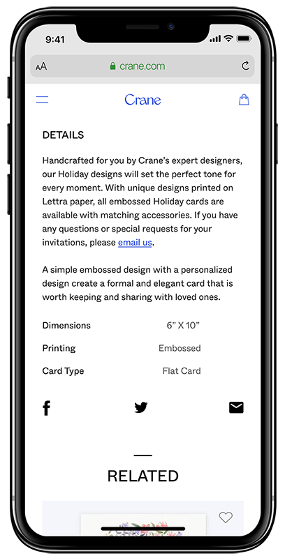
Personalization
Key Findings & Takeways
1. Improved User Experience and Satisfaction:
Key Finding: Users now report a more enjoyable and seamless shopping experience due to intuitive navigation, clear product detail pages, and visible customization options.
Insight: Simplifying the navigation system and adding filters for personalization options and variations helped users quickly find what they were looking for, reducing frustration and decision fatigue.
2. Higher Conversion Rates:
Key Finding: The website experienced an uplift in conversion rates as users were more likely to complete purchases.
Insight: Clear product descriptions, transparent pricing, and visible customization options instilled confidence in users, making them more likely to finalize their purchases.
3. Reduced Cart Abandonment:
Key Finding: Cart abandonment rates dropped significantly.
Insight: By improving the clarity of the product pages and ensuring users understood all customization and variation options before adding products to their carts, hesitation and confusion were reduced, leading to fewer abandoned carts.
4. Enhanced User Confidence in Product Selection:
Key Finding: Users expressed greater confidence in their selections, leading to fewer post-purchase issues such as returns or dissatisfaction.
Insight: Detailed product descriptions, especially around materials, personalization features, and card variations, gave users a clear understanding of what they were purchasing, reducing any mismatch between expectations and the final product.
5. Increased Average Order Value (AOV):
Key Finding: The average order value increased as users were more likely to purchase premium or customized cards.
Insight: The ability to easily personalize cards and explore all available variations encouraged users to invest in more premium options and added customizations, contributing to higher spending per transaction.
6. Stronger Customer Loyalty and Repeat Purchases:
Key Finding: Repeat purchase rates improved, with more users returning for future orders.
Insight: A positive, streamlined user experience built trust and satisfaction, encouraging users to return to the website for additional purchases for future occasions.
7. Positive Customer Feedback and Reviews:
Key Finding: Customer reviews and feedback reflected positive sentiments about the website’s usability and product offerings.
Insight: The improvements in navigation, product details, and personalization tools resonated with users, leading to better reviews, recommendations, and word-of-mouth referrals.
These key findings reflect the success of the website enhancements, demonstrating that better navigation, clearer product details, and an emphasis on customization lead to improved user engagement, higher conversion rates, and long-term customer satisfaction.
More Projects
© 1982 | Product Designer | jkhan@madebykhan.com

